This article is a part of the The Law, Economics, and Policy of the COVID-19 Pandemic symposium.
Policy makers are using the term to describe the effects of social distancing and travel restrictions. In this post, we use a cellular automata model of infection to show how they might do this.
DISCLAIMER: THIS IS AN UNREALISTIC MODEL, FOR TEACHING PURPOSES ONLY.
The images below are from a cellular automata model of the spread of a disease on a 100×100 grid. White dots represent uninfected; red dots, infected; green dots, survivors; black dots, deaths. The key parameters are:
- death rate=1%, given that a person has been infected.
- r0 = 2 is the basic reproduction number, the number of people infected by each infected person, e.g., here are estimates for corona virus. We model social distancing as reducing this number.
- mean distance of infection = 5.0 cells away from an infected cell, modeled as a standard normal distribution over unit distance. We model travel restrictions as reducing this number
In the video above the infected cells (red) spread slowly out from the center, where the outbreak began. Most infections are on the “border” of the infected area because that is where the infected cells are more likely to infect uninfected ones.
Infections eventually die out because many of the people who come in contact with the infection have already developed an immunity (green) or are dead (black). This is what Boris Johnson referred to as “Herd Immunity.“
We graph the spread of the infection above. The vertical axis represents people on the grid (10,000=100×100) and the horizontal axis represents time, denoted in periods (the life span of an infection virus). The blue line represents the uninfected population, the green line the infected population, and the orange line, the infection rate.
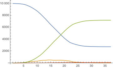
In the simulation and graph below, we increase r0 (the infection ratio) from 2 to 3, and mean travel distance from 5 to 25. We see that more people get infected (higher green line), and much more quickly (peak infections occur at period 11, instead of period 15).
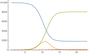
What policy makers mean by “flattening the curve” is flattening the orange infection curve (compare the high orange peak in the bottom graph to the smaller, flatter peak in the one above) with social distancing and travel restrictions so that our hospital system does not get overwhelmed by infected patients.
HT: Colleague Steven Tschantz designed and wrote the code.
This post originally appeared on the Managerial Econ Blog